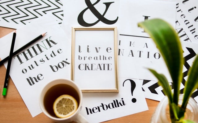
Promotional posters are a great way of capturing people’s attention, and with so many easy-to-use and freely accessible design apps and features, anyone can do it. Follow our step-by-step guide to help you produce an attention-grabbing promotional poster.
Decide on your poster size and orientation
The size of your poster will determine what and how much you put on it. Standard sizes range from A4 (8.5”x11”) to A1 (24”x36”). Think about your page orientation and whether landscape or portrait would work best for the purpose of your poster.
Choose your colours
Choose colours that are bold and noticeable but also clear and easy to read. If you are using a background colour, ensure to check that your text and images will stand out against it.
Consider your message
To capture attention, it’s best if the text is kept to a minimum and in large print, so you should think carefully about your messaging. Aim to convey your message using as few words as possible – this is often the biggest challenge when putting together a poster!
Make it visually pleasing
The colours, images and design of your poster will be what attracts people’s attention and make them want to read your message, so think about how you can make your poster design as visually pleasing and eye-grabbing as possible.
Consider:
- The placement of your text – if it’s a busy page with too much text or too many images it will make it harder to read, so aim for simplicity and clarity over complex designs or multiple images/messages.
- Your text font – with so many options available, it’s tempting to go for something really unusual but aim to choose a font that matches the style of your poster, suits your messaging and is easy to read.
- Images – are you including any? If so, how many and what should they be? As with your text, aim for simplicity and clarity over quantity.
Make sure you have a clear call to action
After reading your poster you will want your audience to take action. Whether it’s attending an event, buying a product or visiting your website – make sure your call to action is clear and easy to follow.
Get a second opinion
When designing a poster for your own product or service, it’s easy to get so close to it that you might miss obvious mistakes or ambiguities. Avoid this by getting someone to proofread it, checking that it reads well, is visually appealing and achieves its aim of encouraging a call to action.
Time to go to print!
When you’re ready to go to print, choose a printing company that will do your poster justice, producing a high-quality finished product. At Ignite Print, our professional staff have experience printing posters, leaflets, flyers, booklets and a wide range of business stationery. We work with our customers to understand your requirements, producing high-quality results to your exact specification. Our customers recommend us for our customer service and print quality.
Contact us to discuss your print requirements and for a quote. We look forward to hearing from you.
